Spread, 2016-
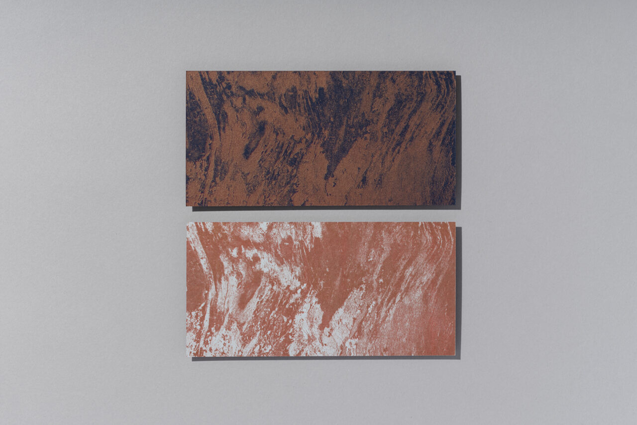
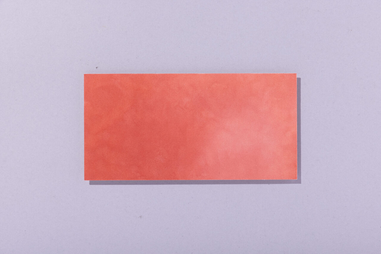
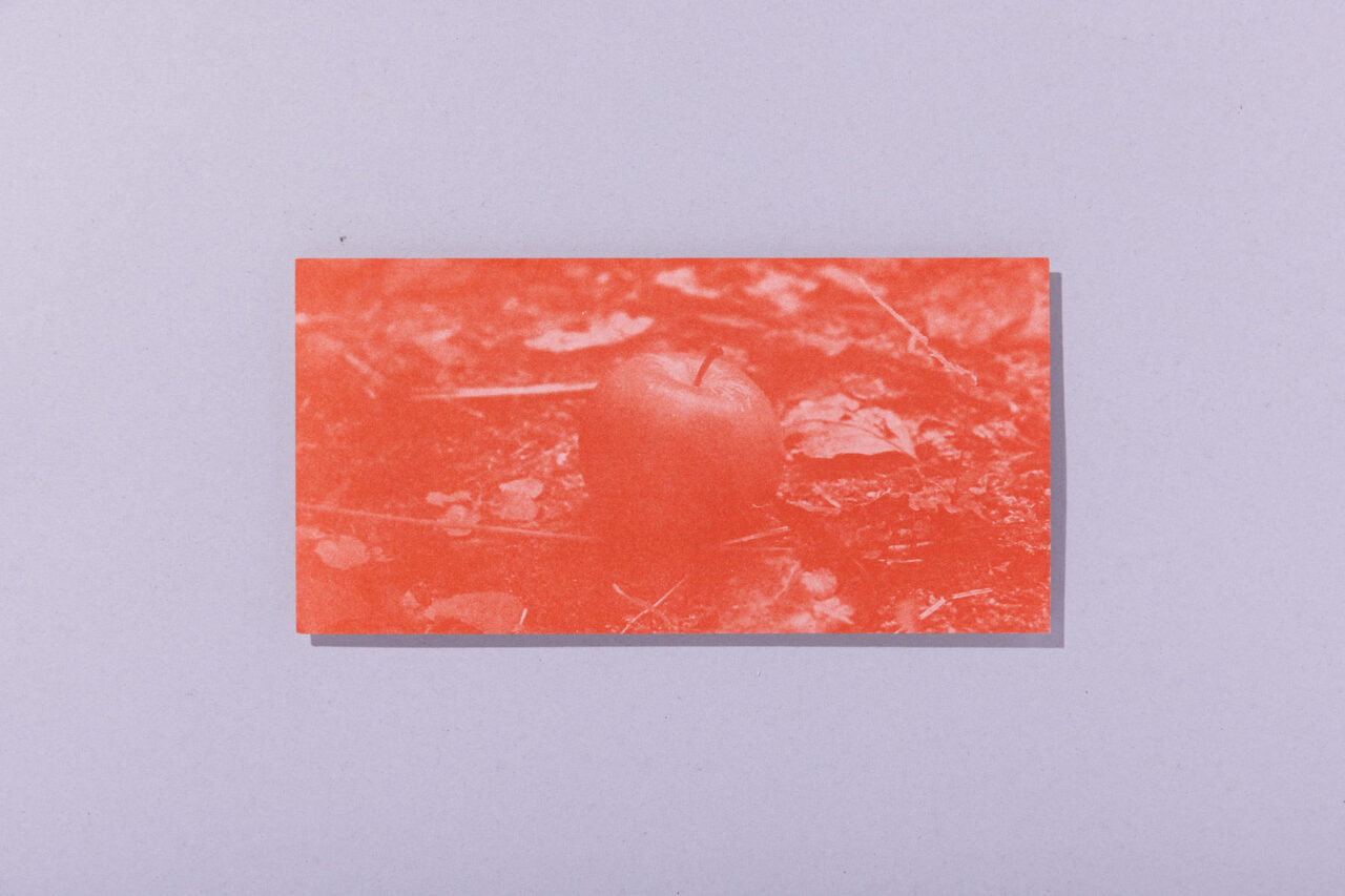
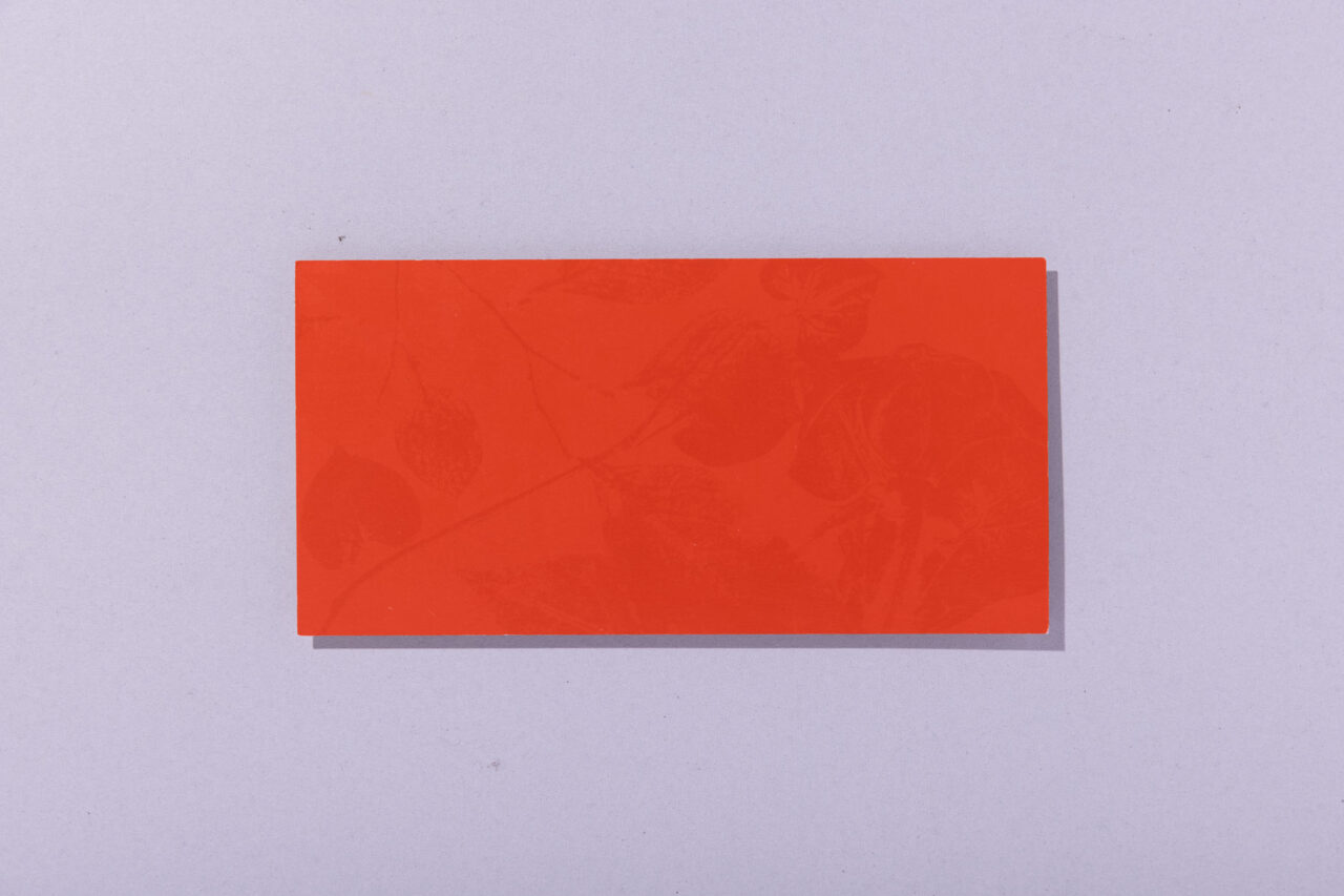
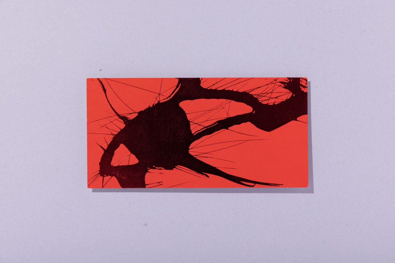
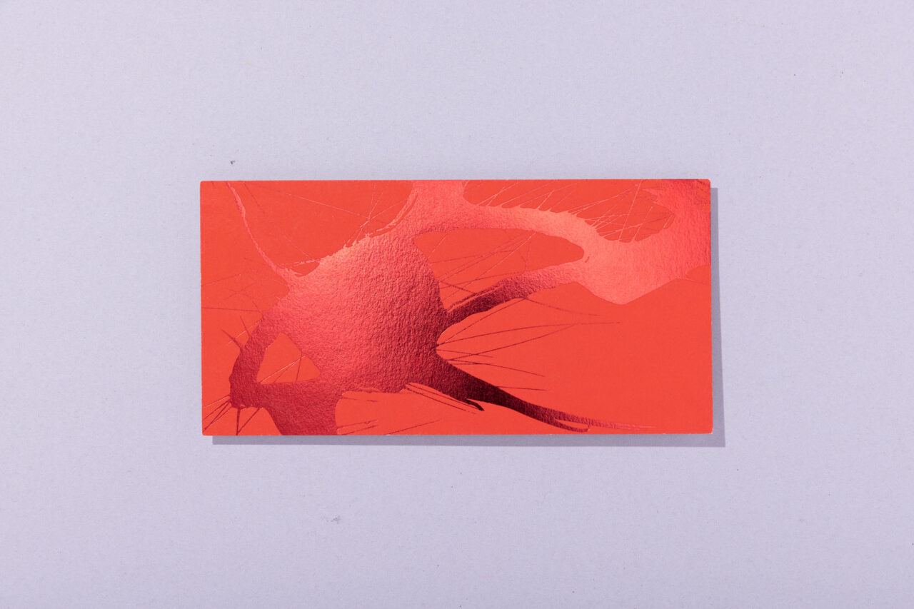
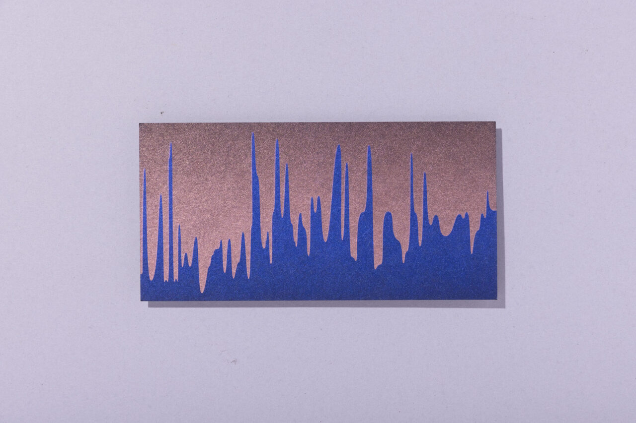
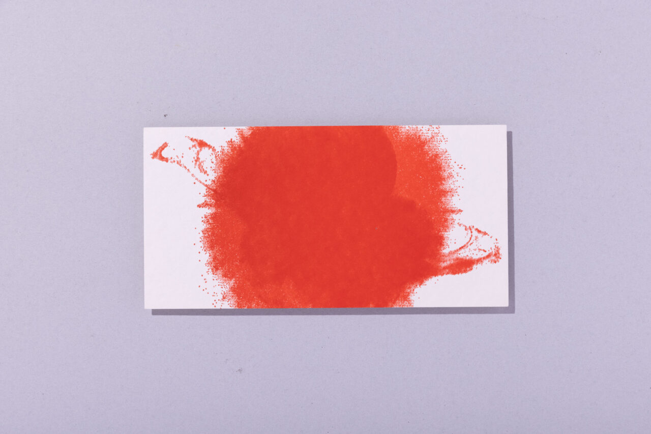
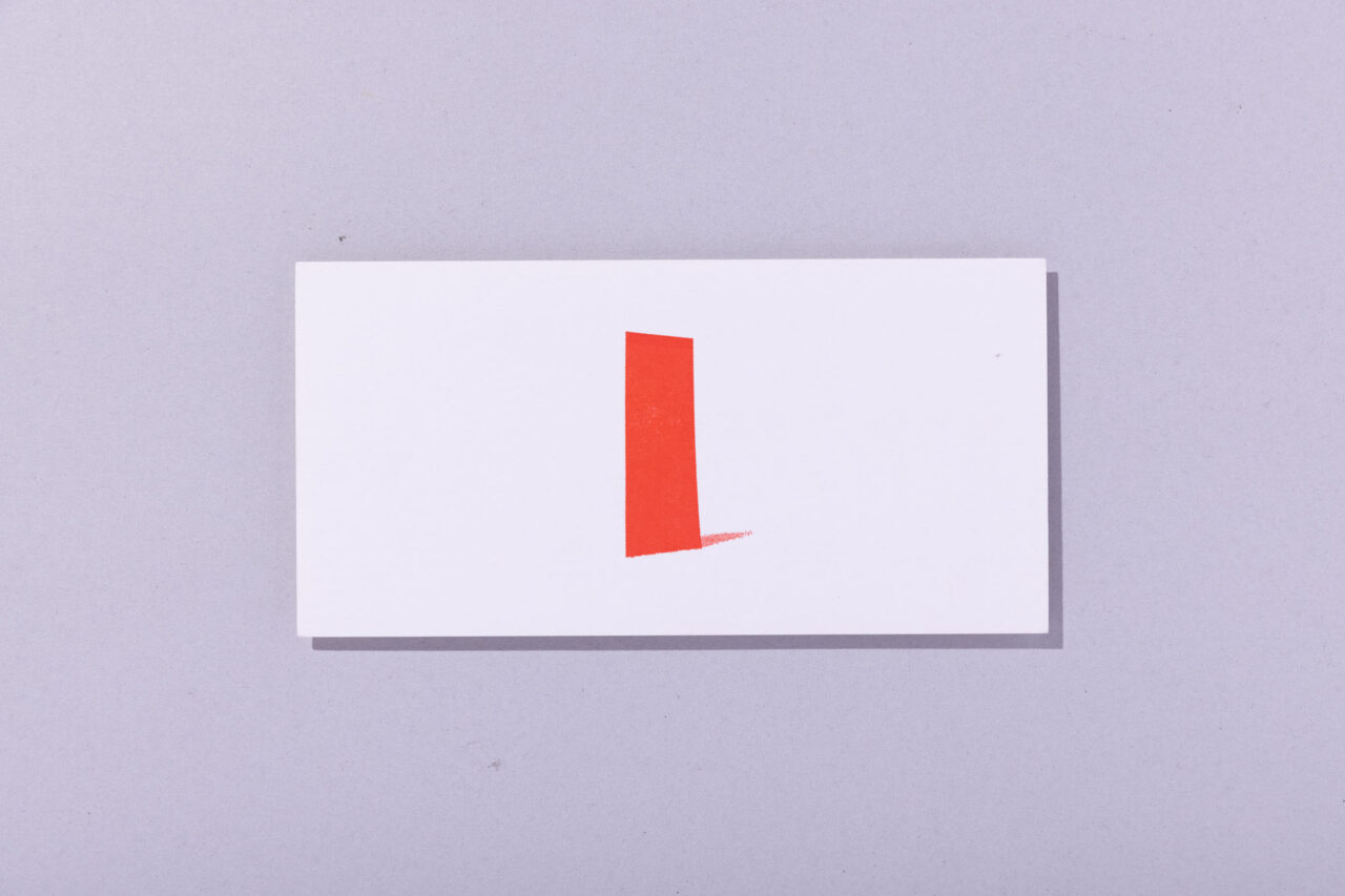
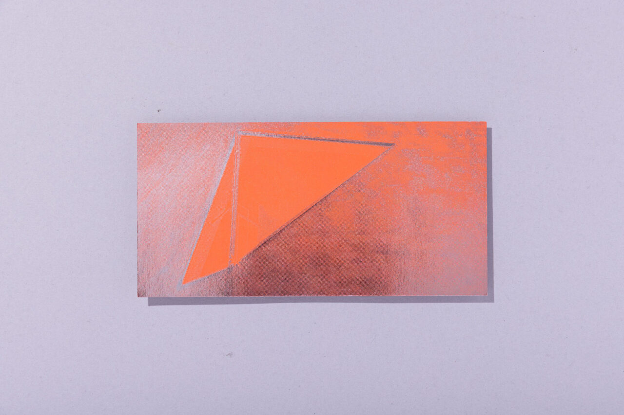
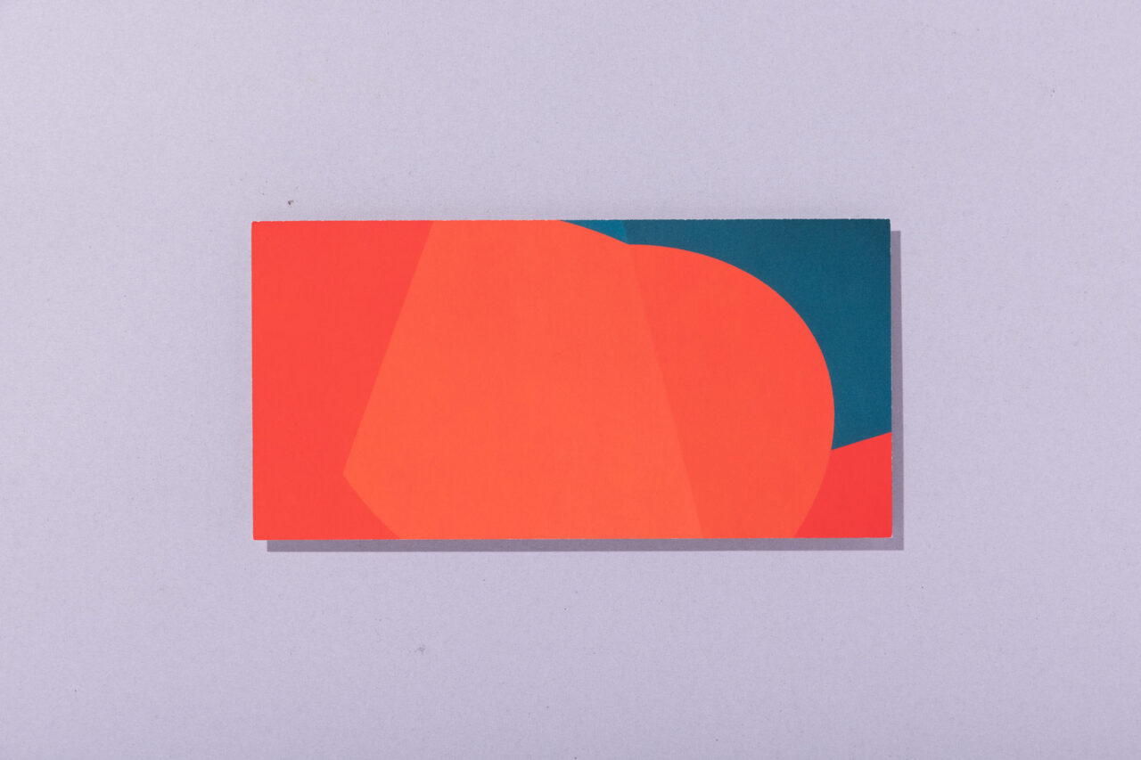
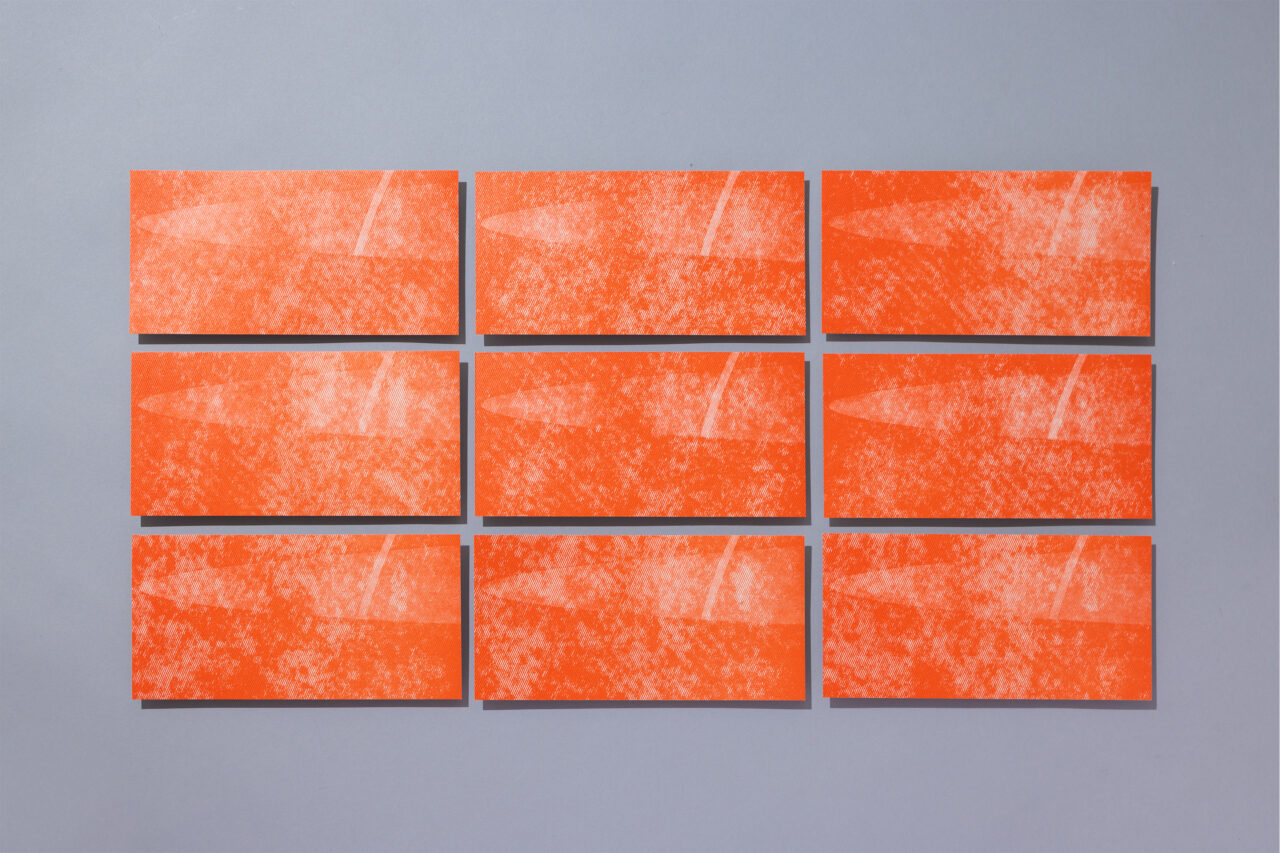
Since our inception in 2006, we have been making Spread Card, a New Year's card which doubles as a year-round message card. Initially, it was mainly to experiment with printing technologies, but it eventually became the platform for studying the design methodology to express the new set themes for the new year. With Touch (left bottom) in 2007, we wanted to design something we could actually touch since we were doing a lot of graphic work at the time. So we chose Momohada, a paper with a fuzzy surface, making the urge to touch it irresistible. Since then, we started to design more tactile works. We were also fortunate that the methods and expressions we experimented with in Spread Card led us to client works. In 2005, Face (third from the top on the right) was printed with the same silver foil halftone dots, as used for Takeo's book jacket, and also utilized in the poster for the 10th Anniversary of The National Art Center, Tokyo. These verifications deepened our mutual understanding with collaborators, including the printing and foil stamping companies, allowing us to build a good team for works in the future.
Art Direction & Design: Spread
More
