The National Art Center, Tokyo, 2017
https://www.nact.jp/pr/download/10th-Anniversary2.pdf
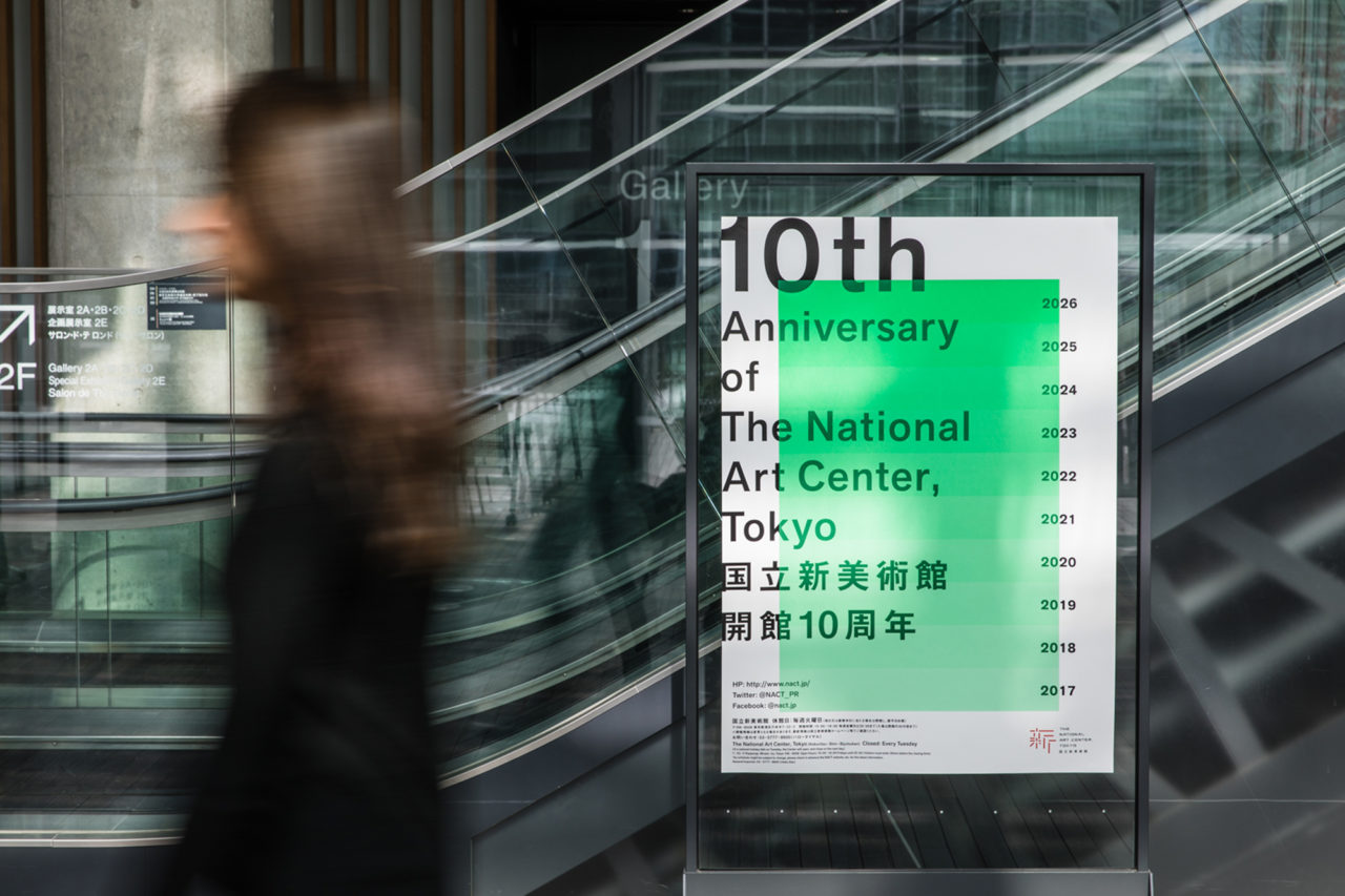
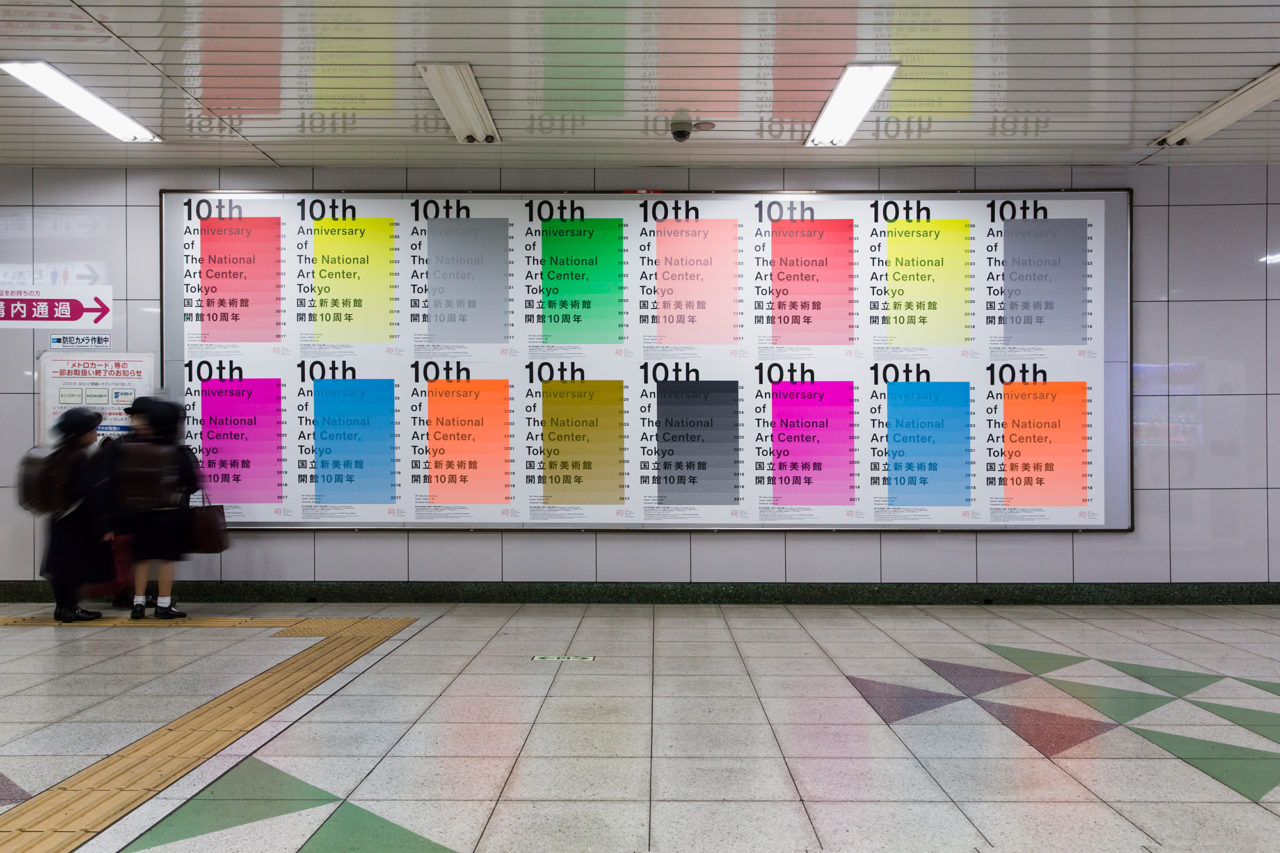
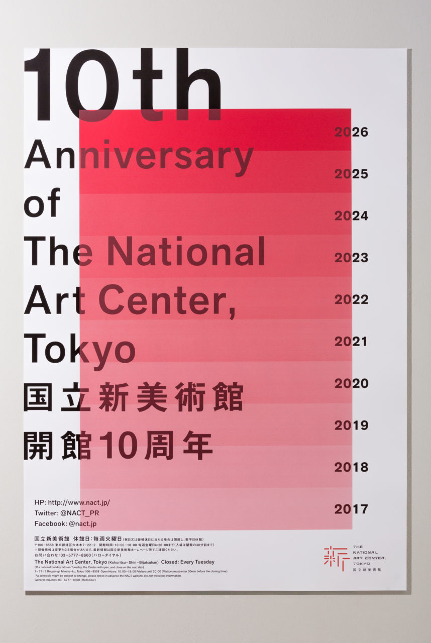
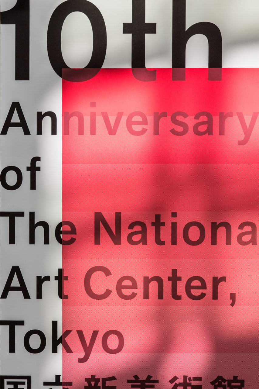
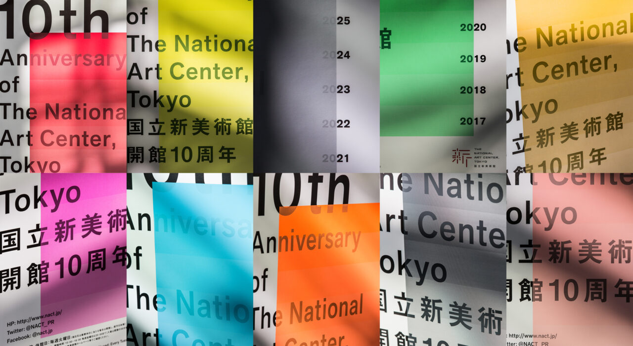
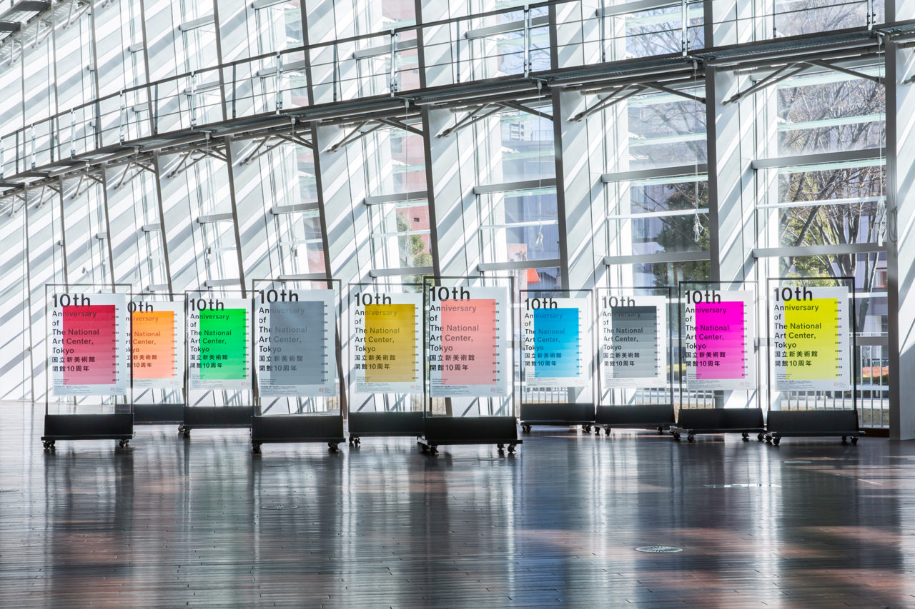
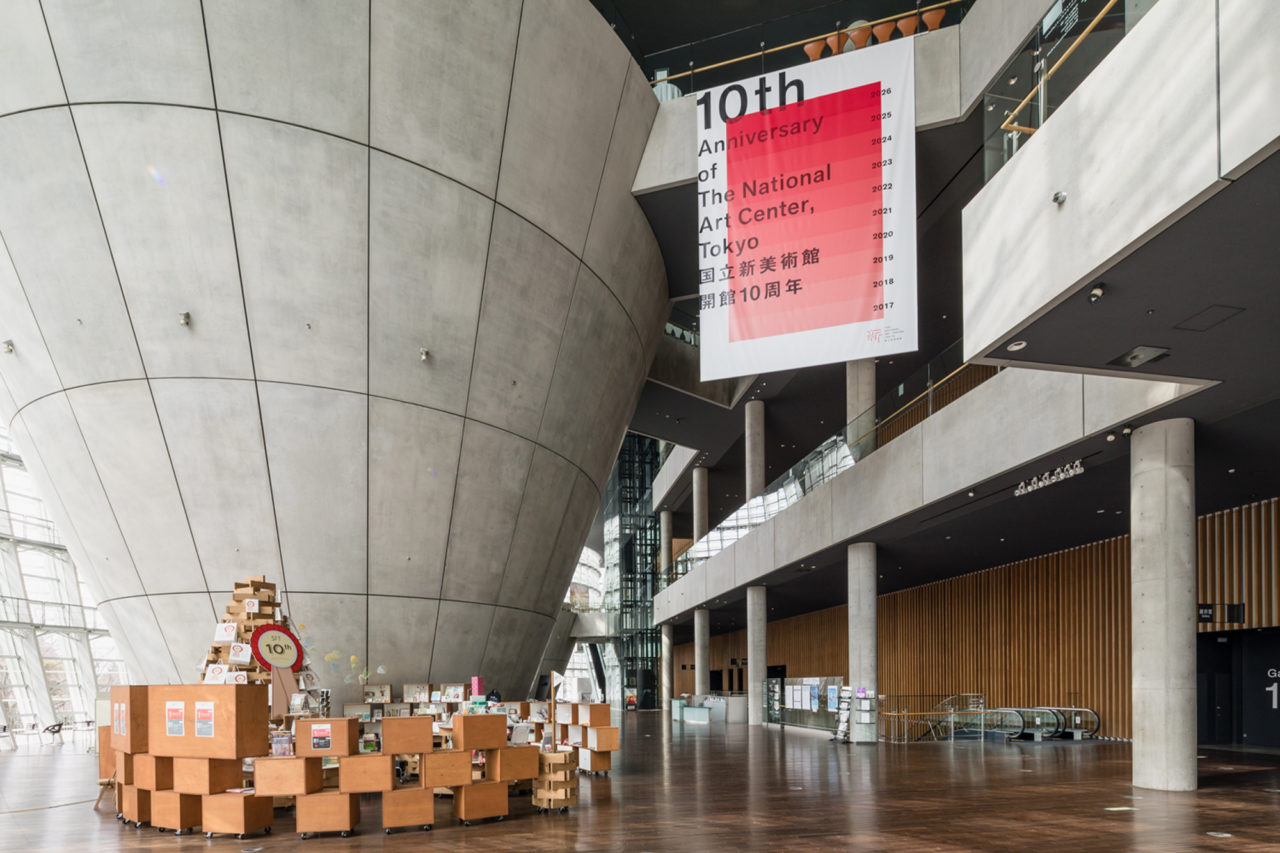
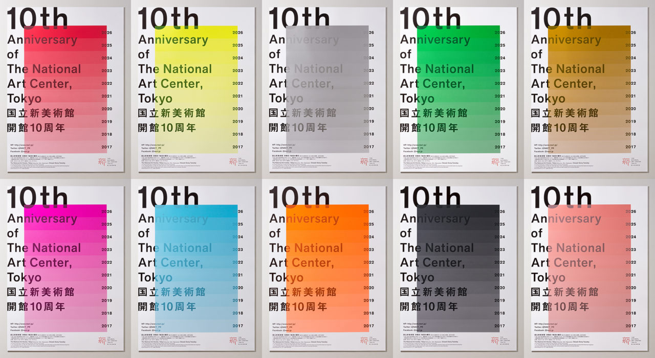
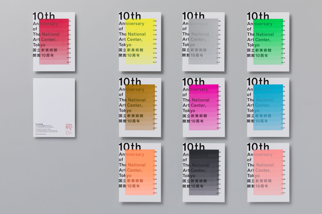
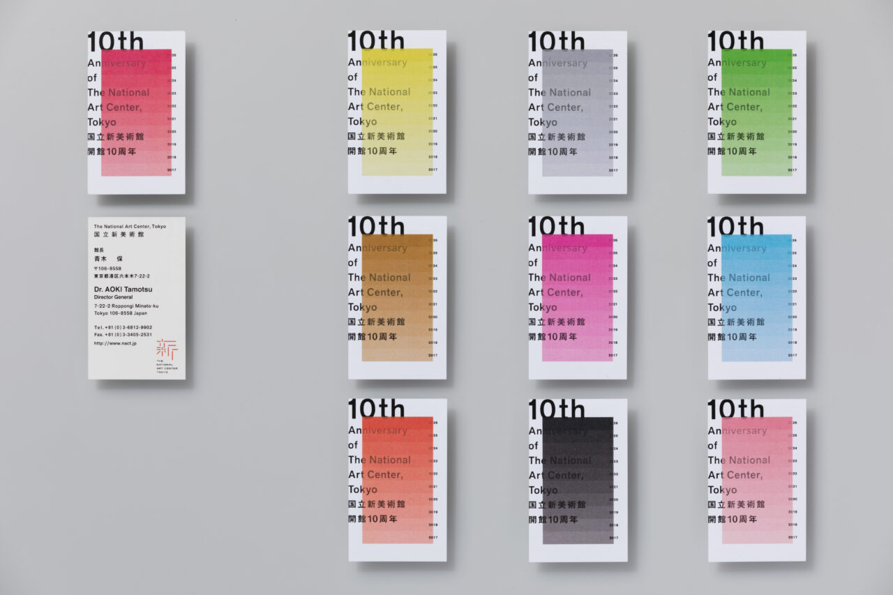
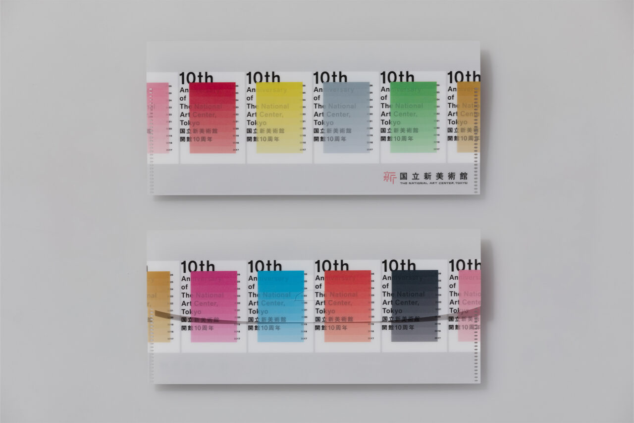
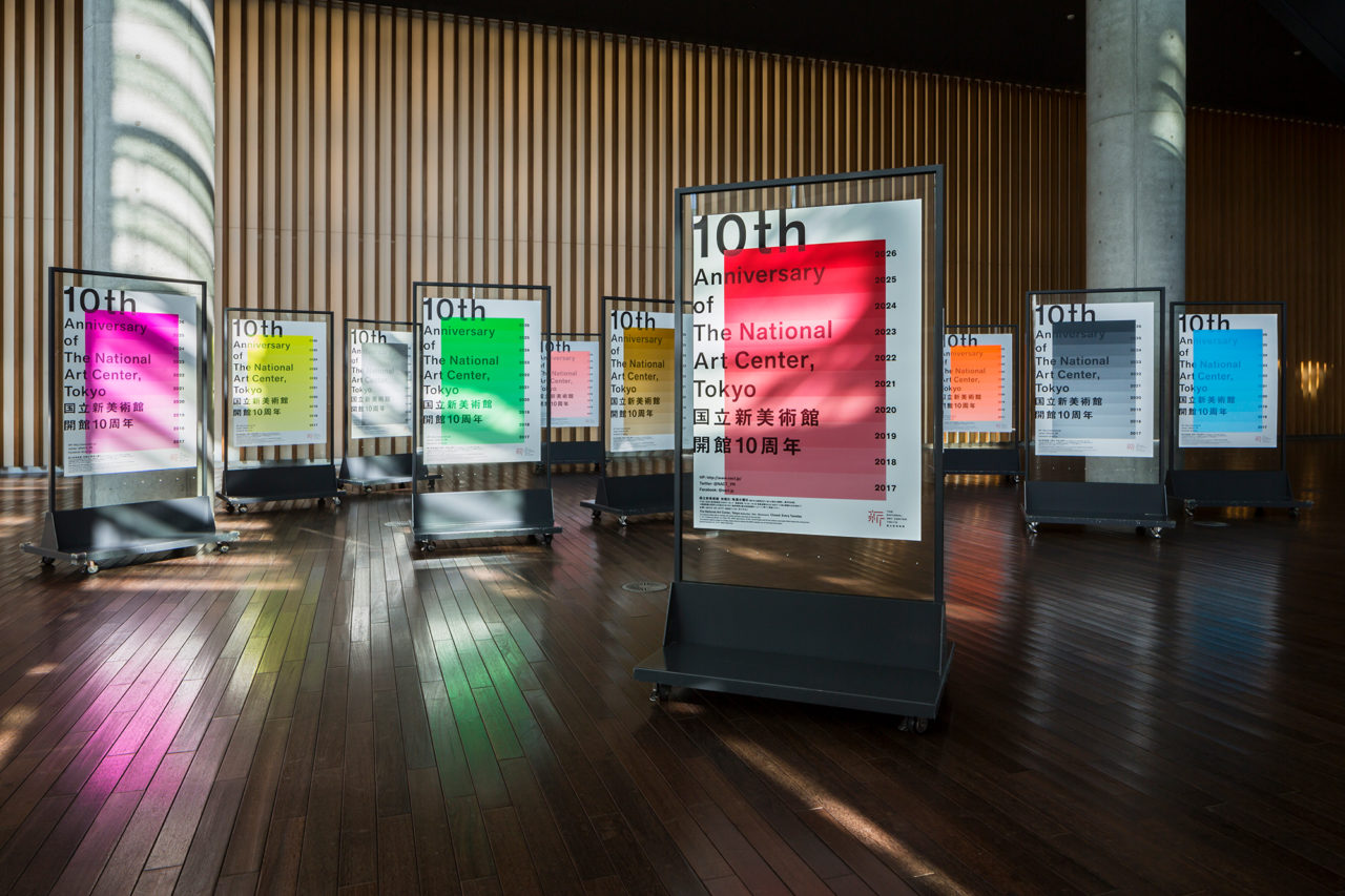
In 2017, The National Art Center, Tokyo was celebrating their 10th anniversary. We provided art direction and design for the key visuals. Their initial request was for only one poster, however, we proposed creating ten posters in association with their 10th anniversary. Originally, they planned to display the posters for a week, but then placed them continuously, throughout the whole year, in various locations in and around the center. Together, the ten posters symbolized the next decade through the theme of ten gradient colors, selected in collaboration with the art center to represent the future. Each color has an individual theme: creation, light, experience, hope, fascination, love, aspiration, challenge, mystery, and humanity. The colors gradually deepen, symbolizing the ever-changing decade, and one’s journey from the past to the future. We believe the large dimension of colors found in daily life bring joy and inspire people to feel energized. The red gradient color resembles a rising sun, stimulating imagination and creativity. We focused on creating space and opportunity through internal and external poster showcases at the station, which fascinated many visitors.
Dates: January 20, 2017–January 20, 2018 (Anniversary of Opening: January 21) / Venue: The National Art Center, Tokyo (Roppongi, Tokyo) / Client: The National Art Center, Tokyo / Art Direction & Design: Spread / Printing: Bihaku Watanabe Co., Ltd. / Photography: Jingu Ooki
More
