Dance Base Yokohama
https://dancebase.yokohama/
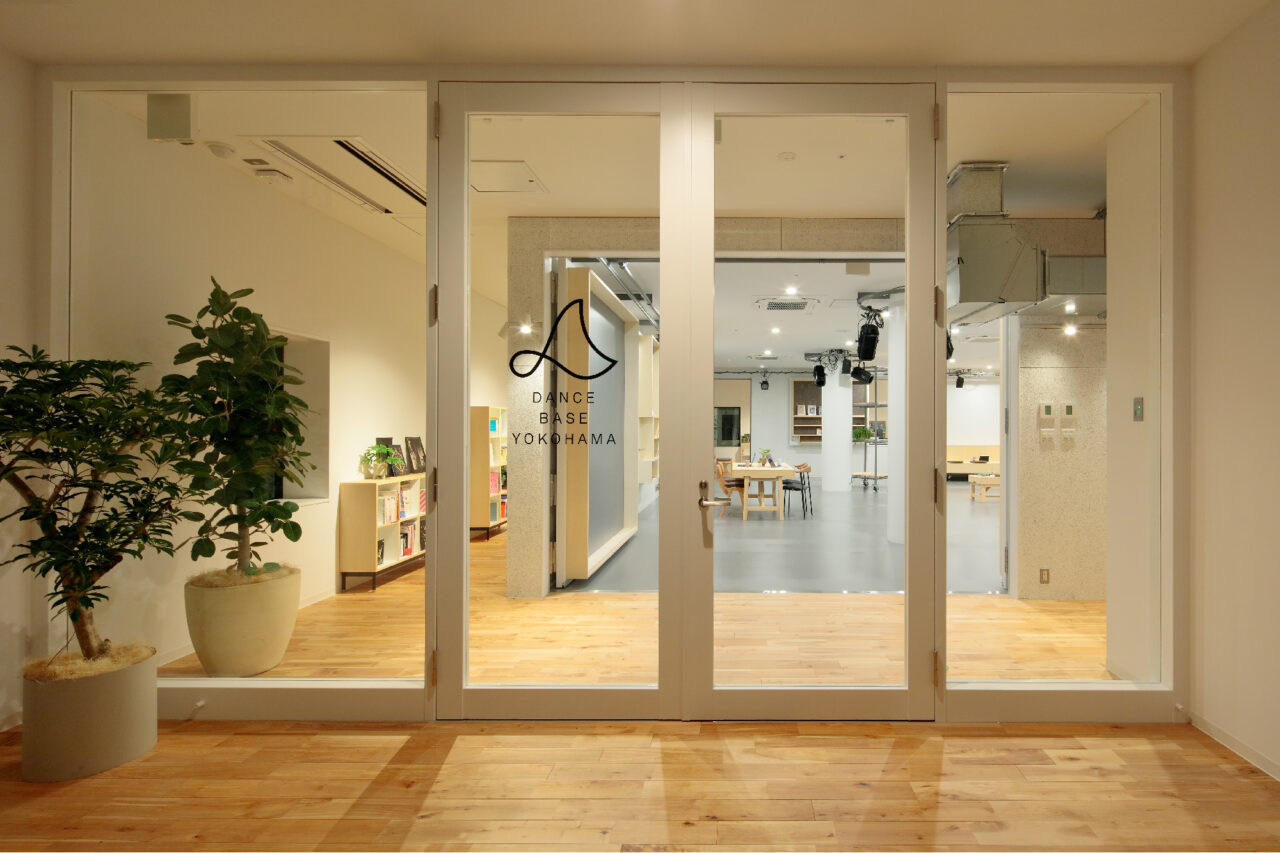
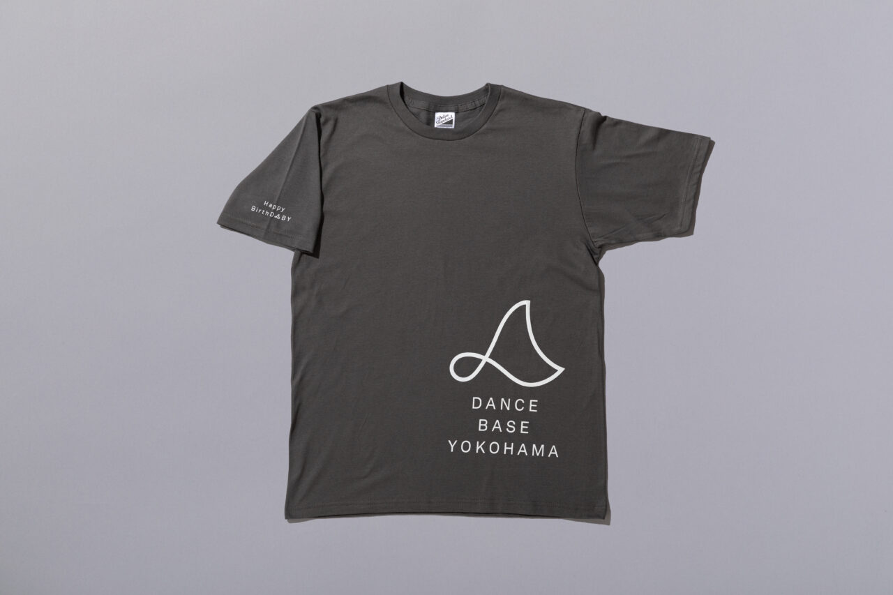
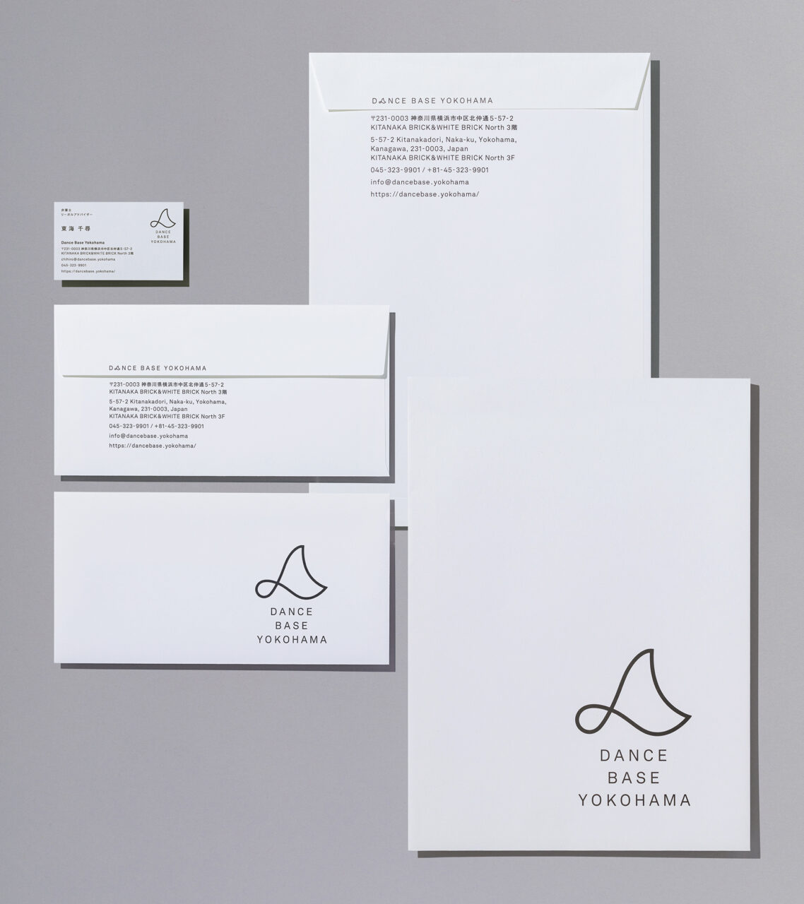
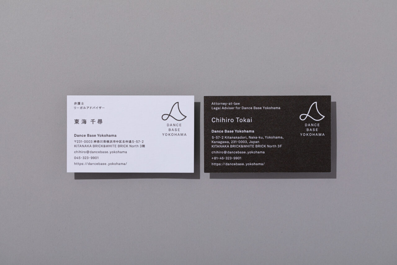
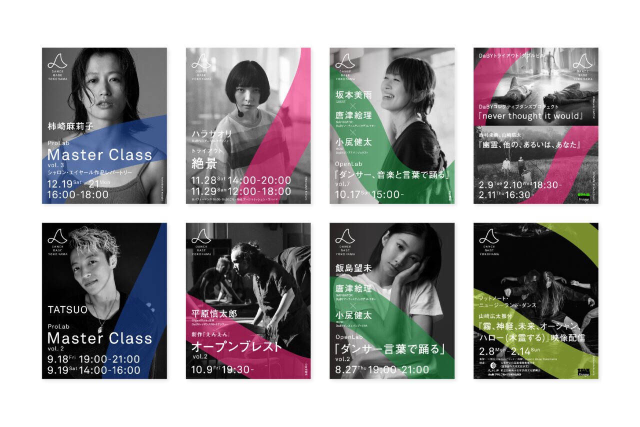
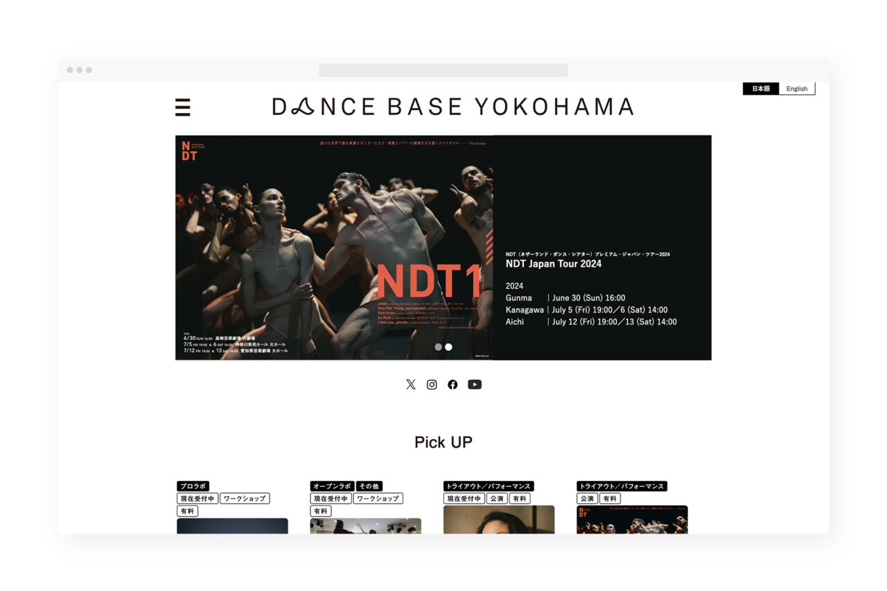
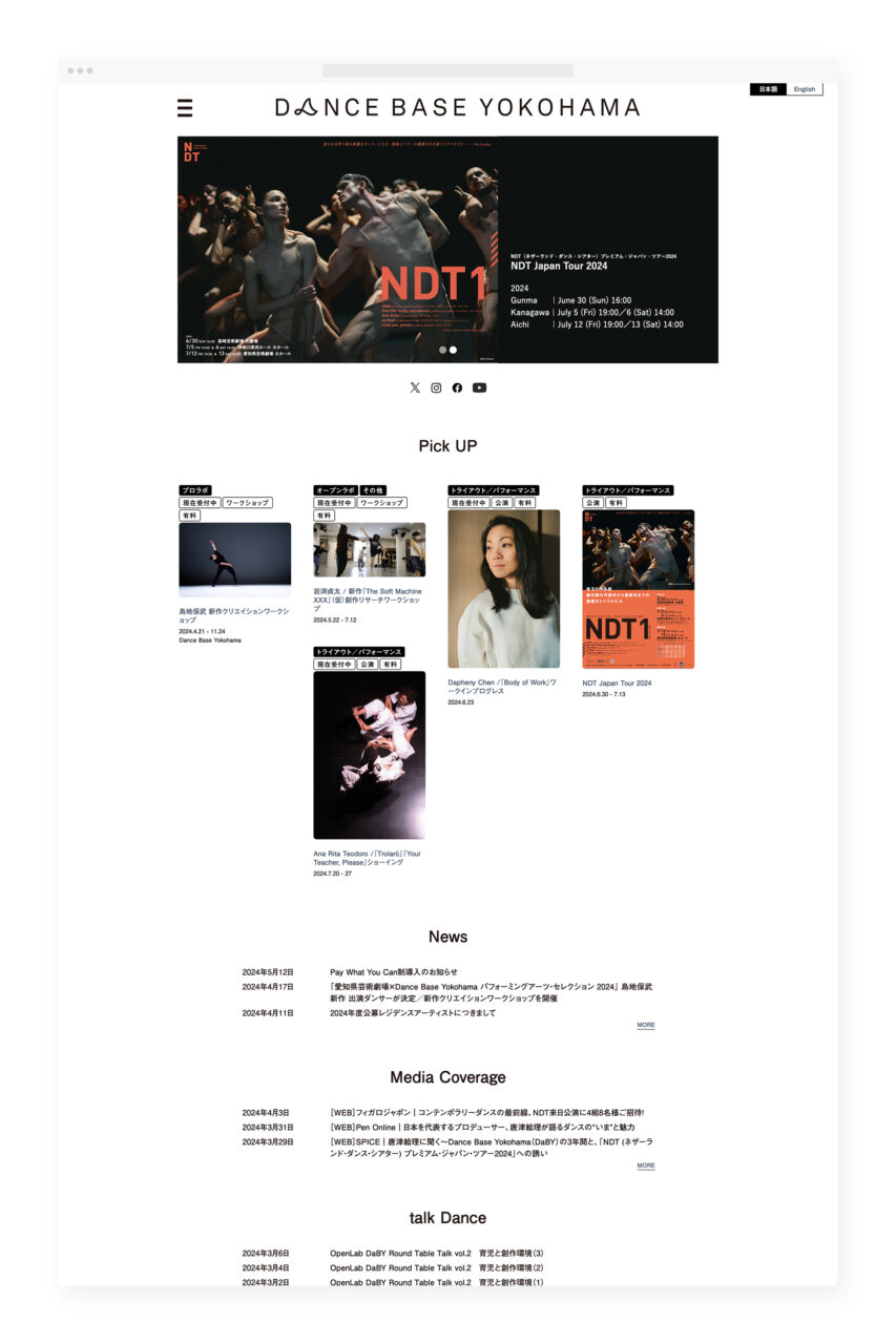
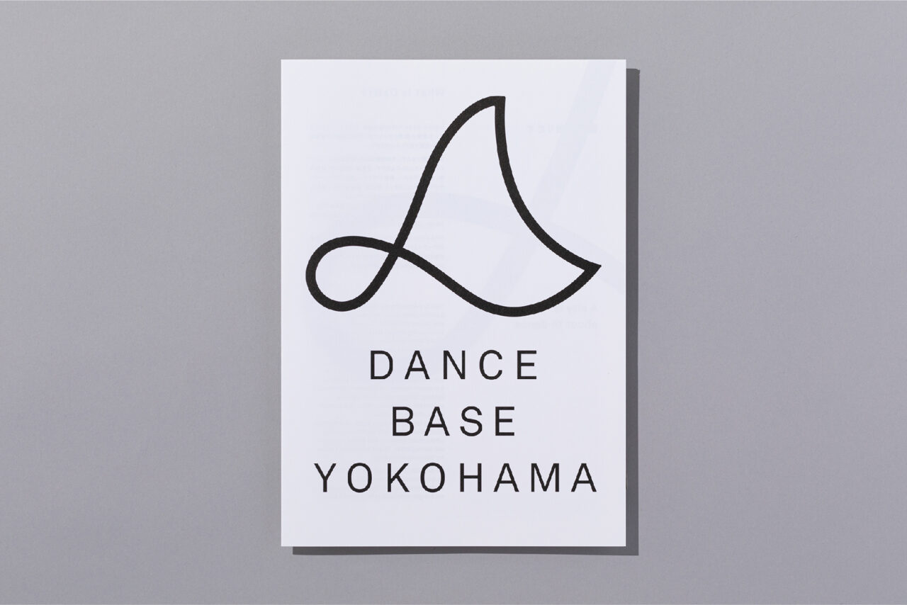
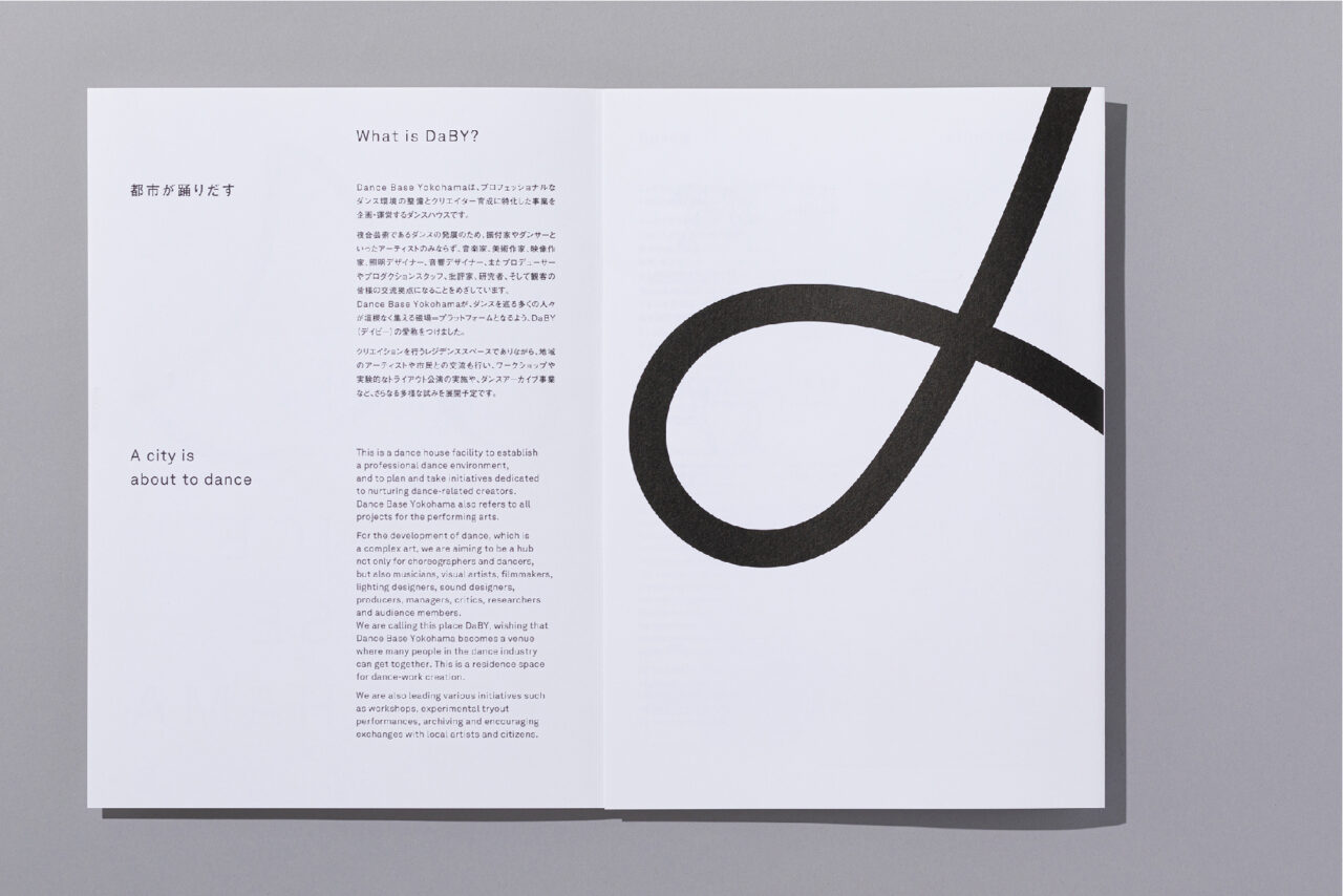
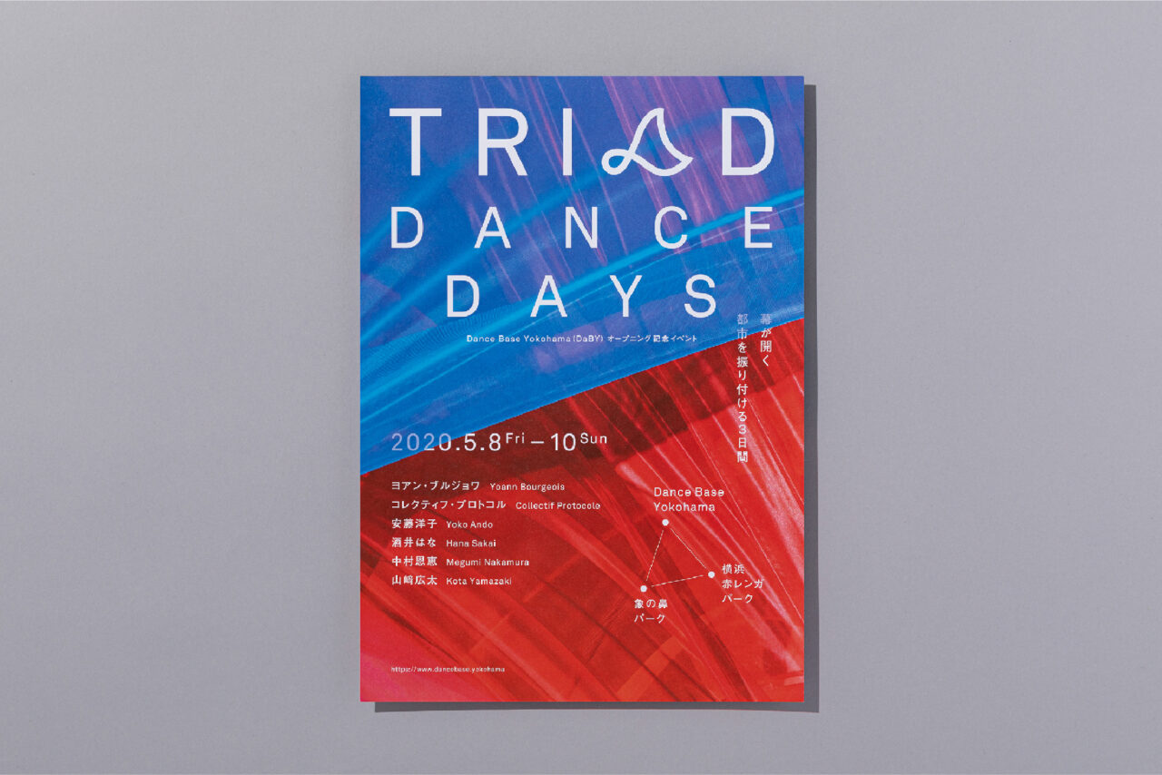
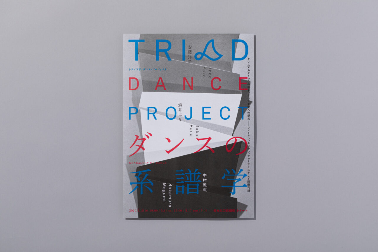
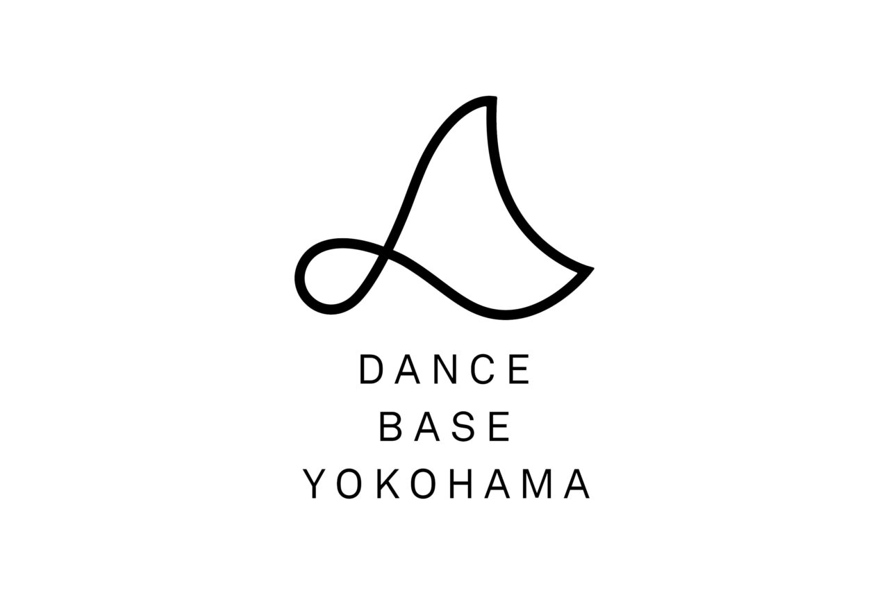
In 2020, Dance Base Yokohama, a center for the performing arts, opened in Yokohama, Kanagawa Prefecture. We were in charge of visuaI identity design and promotional art for the facility. The center provides a professional dance environment and functions as a training facility for cultivating talent. Dance Base Yokohama’s goal is to be an interactive place where creators, choreographers, dancers, musicians, artists, videographers, lighting designers, sound designers, producers, production staff, critics, researchers, and audiences may connect with one another. The concept behind the logo is a flexible triangle. The triangle is a shape used for its strength in the construction of bridges and buildings. By twisting one corner of the triangle, which symbolizes strength, we added an element of softness, alluding to the need for flexibility in society. In Japan, contemporary dance is a relatively unfamiliar genre removed from daily life, so we wanted the logo to feel welcoming. The familiar shape of the logo may look like a wave, a bird, or a fish. The logo can also be interpreted as a dancing “D,” the first letter of the facility name.
Artistic Director: Eri Karatsu (Aichi Prefectural Art Theater Executive Producer) / Space Design: Hirotaka Isshiki + Narumi Ozawa + Shiori Mori + Ondesign Partners / VI Design & Promotional Art: Spread / PR: Miho Kawamura (Daily Press)
More
